
 Earlier today I was flipping through Martha Stewart’s Homekeeping Handbook: The Essential Guide to Caring for Everything in Your Home, by Martha Stewart. First of all as much as I respect Martha, I doubt this entire 700 page plus monster of a book is entirely ‘by’ Martha Stewart. As knowledgeable as she is in the Domestic Goddess category, there’s no way she can know all this information. I think the book should be ‘by’ Martha Stewart and a huge team of editors and midlevel research assistants. Anyway, I was looking to see if Martha knew how to remove severe burnt spots on an enamel piece of cookware. Of course she does. It includes salt water and letting it sit overnight. The jury’s out on whether it works. I’ll know in the morning. I won’t discuss how the burnt spots got there in the first place, but I did assume that before Martha told me how to remedy the situation she would chastise me for burning up the pot in the first place, “If you are stupid enough to burn something in an enamel pot, this is my solution on how to salvage your mess,” she’d say. But she keeps her snide remarks to herself.
 Actually this post is not about her book, which was published back in 2006. But, I can say it is a handy book to have around. There are some things in the book that seem a tad elementary and I want to say, ‘Come on Martha, who doesn’t know that.’ But, then again I can’t get the burnt spot off my expensive enamel cookware, so I should just keep my mouth shut. While flipping through the book this morning I noticed a few photos of some interiors of Martha’s that I had recognized and I’ve seen her use frequently in other publications. I assumed they were from her old Turkey Hill home. So, after a quick look through my Martha Stewart Living section in my magazine library I found the house. It’s not even hers! It’s actually the New York
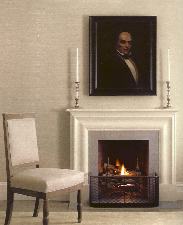
Everyone knows my favorite color is Gray – all of them. This is one reason I’m attracted to this particular home. But I also like the Jefferson/Monticello influences and the fact that it’s masculine. It’s hard to see in some of the photos, but many of the room’s ceilings are a soft light blue. This was published in 2005 and the gray paint palate and gray and tan linen fabrics are right in tune with what’s happening currently with interiors today.


 |
| photo credit William Abranowicz courtesy of Martha Steward Living, September 2005 |
I went through my gray phase, and thouhg I love gray, I found that I just don't hav ethe right house for it. I think that you have to have white woodwork to really make it sing, and I don't, nor will Scott ever allow me to paint it. It's the one thing I haven't been able to manipulate him to do. But I'm trying ... DAILY! LOL! :)
ReplyDeleteit was a very nice treat to find your blog today
ReplyDeleteI have Marthas' book and the article you referred to one of my favorites as well