Monday, October 31, 2011

Faked Out

OK...so this is a fashion post, but I couldn't help myself.  I like W.  I always have.  Yesterday while piled on the sofa sipping coffee and flipping through the latest issue I noticed this ad - for obvious reasons!  And, I must say I studied it for quite awhile.  However, I paid no attention to the name of the product being adverstised - again for obvious reasons!


Several other ads caught my attention.  Joan Rivers doing a knock-off  'what becomes a legend' ad? All I focused on was her face.  "Jesus, she's been airbrushed to death," I thought.


Also, This one caused me to pause for a moment.  Not because of the model's state of undress, but because I knew she was a drag queen from RuPaul's show.  Still, I didn't paid attention to the product or question her as the model, I just thought..."Good for her. She got a job.  But, boy did she tuck her junk.  That has to hurt!" 


W can be alittle out there so I didn't think anything about it.  And again, what I find most interesting, especially considering my retail and marketing background was that I paid NO attention to the actual product the ads were representing.  Come to find out they are all fake!   W placed nine fake advertisements, each shot by the Steven Meisel in the issue. See them all HERE

Tuesday, October 25, 2011

Friday, October 21, 2011

My Garderner's Chores

photo credit Alexandre Bailhache
We managed to get the boxwood garden trimmed again.  That's the final time for the year!

Hallelujah!

I wish I had more formal hedged gardens.  Also, I wish I had a gardener!  If I had a gardener I'd make him trim hedges until his fingers bleed.  Here are some great examples of what I'd make my Gardener maintain.

I'm taking applications.


photo credit Bussonline & Bergman

photo credit Clive Nichols

Fearrington House

photo credit Francois Halard

photo credit Garry Gunderson

photo credit Jerry Harpur

photo credit Jerry Harpur

photo credit Jerry Harpur

photo credit Jerry Harpur

photo credit Nicola Browne

photo credit Richard Felber

Monday, October 17, 2011

Great Grand Print

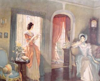
My house is pretty butch!  Maybe that’s not the best way to describe it.  But, there’s no question it leans WAY to the masculine in terms of décor so one could question why this prissy old print hangs in my guestroom.  It’s by an artist named Fredrick Mizen who worked during the first half of the last century.  It’s called Love Letters and this particular pic belonged to my paternal great grandmother. Being in good condition and the original frame it’s worth the small fortune of $250 – at best.  Evidently Mizen’s work was very common and today is readily available.


My great grandmother passed in the 1970’s so I never really knew her.  That’s her in the black and white photo – the large women.  The other woman is my father’s aunt.  The aunt was still in high school when this photo was taken sometime in the mid 1950’s. She’s pushing 80 today, still going strong and probably still the hit of the local bowling alley. 

You can see the pic hanging over the sofa in my great grandmother’s house.  I don’t remember the pic being in this house.  The house was abandoned in the 1960’s and later burnt when I was a very little kid.  For years the pic hung in the living room of my grandparents.  As a kid I was obsessed with it.  Perhaps because it stood out in a room full of 1970’s early American furnishings, scratchy brown fabric, nylon wall to wall sculpted carpet and hunt paintings.  Love Letters was the only thing in the room that didn’t have a fox, dog or horse on it!  Actually, there were other reasons I was obsessed with the print.  While other boys were trying to get into the neighbor girls’ panties or harassing kittens, I was indoors drawing house floor plans and watching Merv Griffin.  As a ten year old I wanted to be an architect, but since math turned out not to be my strong suit, my career direction later changed to Anchorman, then Movie Star, then photographer, then Broadway Singer, etc...

I was quite good at conceptualizing unique and original home designs.  I was even better at redesigning the typical ranch which was the rage at the time.  My additions of indoor pools, multi-level bathrooms and interior atriums took the basic ranch to an entirely new level.   As a budding home designer I was perplexed with Love Letters.  From a floor plan perspective, those women’s house made NO sense to me.  There was a huge exterior window impossibly placed and immediately next to it was an interior door leading to another room.  I attempted floor plan after floor plan to try to justify the artist’s interpretation of the houses layout, but to no success.  To make things worse, even as a ten year old I knew what these women’s house really would have looked like. 

My father’s other Aunt (a church lady not bowling alley queen) lived in an old plantation house.  At some point she sold the old house and built a big boring ranch.  But, she lived in it late enough that I remember it and thought it was grand!  It was very typical of the period and under no circumstances did the architectural situation depicted in the print mimic the aunt’s house.

I also I had major issues with the Love Letter’s window treatments.  Growing up in South Carolina it was mandatory to have viewed Gone with the Wind at least three times prior to starting the fourth grade, at least according to my mother.   Scarlet did not have drapes with short little matching valances.  Everything was heavy, draped, fringed and of course velvet.   Not to mention there are pieces of furniture in Love Letters which looked suspiciously like bad mahogany 1930’s/1940’s reproductions to me.

My grandmother told me the women were reading a letter from their love interest who was at war fighting the Yankees.  I think she was wrong.  I was sure the letter was probably from the Historical Society, DAR or Women’s Auxiliary League outraged by the women’s obvious ill-designed renovation and the hiring of a failed interior designer and the letter was telling them to get that house back in shape.


Now, years later I find myself again staring at Love Letters and feeling exactly the same – there’s a bunch of messed up stuff going on here in a not so good piece of art (don’t get me started on how many times I rethought those dresses).  However, I’m still as intrigued as I was as a ten year old.  But, now I’m intrigued by what has stuck with me as opposed with what doesn’t make sense.  I could hang Love Letters in any room in my house and it would blend into the wall color.  As you know, everything in my house is grey, gray, or greige like that old money green wall color in Love Letters.  Also, I’m a big believer in glossy white trim and white ceilings and most importantly I live in the real version of that house and my renovation wasn’t botched!

Friday, October 7, 2011

Room Inspiration


I've mentioned before my house has a front center hall with identical sized & shaped rooms on either side.  I use them as a dining room and living room.  Actually, I refer to the living room as the Salon which just sounds far smarter (or gayer).  If I ever get tired of how they're decorated (or when I get tired of how they're decorated) these two pics could be inspiration.

Thursday, October 6, 2011

In The Corner

The sofa in our media room has a high back and sides.  I like to curl up in its corners.  It gives me a good vantage point of the side foyer.  I feel protected so if anyone bust in the door while I'm watching the OWN channel I can see them coming!  I think I'd feel fairly protected in most of these!

photo credit Melanie Acevedo

photo credit Peter Vitale


photo credit Mick Hales

photo credit Pieter Estersohn

photo credit Roger Davies

photo credit Tria Giovan

photo credit William Waldron

photo credit William Waldron

photo credit William Waldron - obviously this guy likes to take pics of things in corners - I like him!

OK - this is a furniture ad, but you gotta admit - pretty sexy!

Tuesday, October 4, 2011

Pic of the Day - Draped

Tell me why I love this image? Is it 'old lady' or cool?  That settee's (even the word is 'old lady') fabric is very 'old lady'.  So is the table, the floor lamp and especially that stupid poof of flowers.  But that wing chair is kinda fine and I think I'm loving that huge drape!


photo credit Peter Margonelli


Monday, October 3, 2011

Fall is officially here.

Don’t pay attention to the calendar (that doesn’t mean anything), the declining temperature (those swings in temps are just due to climate change) or Al Roker (food is his thing – not the weather).  Pay attention to me.  I have the best indicator for the change of seasons. 

There are tons of bulbs that pop up around my house all year long.  Over the years, I’ve gathered and moved some but mostly I just leave them alone and let them do as they please.


My grandmother calls these Red Spider Lilies.  I’m not sure that’s really what they are called; Granny is 97 and still terrorizing the old folk’s home, so she’s obviously gotten something right.  Anyway, I can accurately predict the fall season by these lilies.  Regardless of the temperature, the day these bulbs start poking themselves out of the ground, I know I’ll have only three more weeks before I have to put away my sarong & flip flops.  I’ll have to mothball my standard daily uniform of Gap boxer shorts and tee shirts and actually start wearing clothes again.  Three weeks ago it was around 87 here and I was still splashing around in the pool with a glass of wine, when I saw the first spider lily appear.  Sure enough I’ve now been forced to put on pants that go below the knee and socks on my feet!  I guess I’ll need to get my ass to ATL and get my full length mink out of storage soon!


Related Posts Plugin for WordPress, Blogger...