Monday, January 31, 2011

New Orleans Bargeboard

Most of the second floor of our house has the original planked walls, ceilings and floors.  I am always intrigued by the primitive atmosphere created by wood planked rooms.  When we did our renovation we had the walls in several of the addition’s new rooms planked.   

I had never heard of Bargeboard until I found an article and these photos of this house in New Orleans.  The term Bargeboard comes from an architectural style of Creole town houses made of timber transported down the Mississippi during the 19th century.  This particular house is an 1830 Bywater district home, adjacent to the French Quarter. 

Lately, we’ve been thinking that we need to simplify, so I’m appreciative of how pared down this New Orleans house is.  I couldn’t do it; simplified or not, I have to have places to lounge and modern conveniences. I’m all about primitive style, but it needs to be mixed with modern to make me comfortable.  But, you have to appreciate the care, skill and style that have saved this Louisiana house.  The owners did a great job of restoration and capturing the authenticity of the period and the house’s Caribbean heritage. 


photo credit Toni Meneguzzo
courtesy of The World of Interiors

Wednesday, January 26, 2011

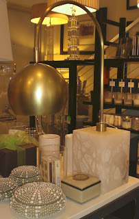
Bright Lights

Yesterday I had appointments in Atlanta and as I darted from one place to another I passed by DRTC Studio on
Juniper Street
in Midtown.  Our condo is at Metropolis across the street, but fortunately it’s rented, so unfortunately I’m not in the old neighborhood as much as I used to be.  And quite frankly, anymore when I’m in the ATL combing my design haunts. I tend to gravitate towards the design area on the Westside; so it was nice to reacquaint myself with DRTC.  Although the studio itself was still in post holiday transition mode, I remembered one of the things I always liked best about DRTC.  They have great lamps.  Here are a few.  Next time you’re in the area drop by.  They’re at 905 Juniper and I’m sure Tim, shop keeper extraordinaire will be happy to show you around.


photos by Randy Pender for A.J.Barnes

Monday, January 24, 2011

A Modern Farmhouse

A few weeks ago I posted Interior Designer Darryl Carter's formerly published DC townhouse - Classic Townhouse 1.3.2011.  I loved the casual formality of the DC townhouse.   In a separate 2008 issue Elle Decor also ran a feature on his Virgina farmhouse.  The farmhouse is far more 'rustic-meets-refined', but still his clean sophisticated style shows through. 


photo credit Simon Upton

Friday, January 21, 2011

Plants Inside

photo credit Richard Felber
If you are a regular reader of this blog, you already know that I’m a big Ina Garten fan. I love her show, her food and her top of the line kitchen/barn/TV studio/office/dining room. Recently I was watching her show and lost track of whatever she was cooking because I got all messed about a Ficus tree.  From one angle I noticed she had this huge tree standing in front of a window. 

“Really,” I said to myself out loud. “A Ficus. That’s so 1985!”

It started me thinking about indoor plants again.  Other than C and myself, I banished all living things to being outdoors years ago.  When we moved into our first house in the 1980’s it was in a small town outside of Charlotte, North Carolina.  We quickly became friends with some of the more fashionable neighbors.  We all had Ficus trees.  In fact, most everyone I knew had Ficus trees in the 80’s.  I don’t know why, because generally they looked like shit unless they’re used as a trimmed hedge in Palm Springs!  I guess it was because they were cheap.  But, unless you had a perfect place with the perfect light they never looked good.  And good light or not, if they were disturbed even in the slightest all the leaves would fall off almost immediately.  Every few months it seemed that my neighborhood friends and I would be hauling home a new Ficus because the single remaining leaf fell off the last one.  So usually everyone’s Ficus looked like it was in a constant state of severe shock and we were always sweeping up brown leaves.

photo credit Frederic Vasseur
When we moved to Atlanta, I remember hauling several sad looking ones with us.  The first couple of years in the ATL we moved about three times, so regardless of how much light the damn things got; they never had more than a handful of leaves on them.  Finally we bought an older house in an Atlanta ghetto.  The biggest tree found a home in our bright kitchen.  It really was too crowded in the kitchen for the tree, but since it was the only room in the house that wasn’t cave like, that’s were the tree went.  I placed the second one in front of a bathroom window, where its branches knocked you in the head every time you passed by.  They managed to live on – barely – for years.  Whole sections would die off, but I’d just rotate their pots, dust them off and throw more water at them. 

After we bought the country house in the mid 90’s I moved the trees here thinking they would have a better home.  They both were now about 7 feet tall with two branches each and about 38 leaves between the two of them.  I had a few other indoor plants.  I have brought a couple of ugly Mother-In-Law Tongues home from one of the department stores I was working at and also always had a few potted Spaths setting around the house.  I guess I wanted to be reminded of a hospital room. Eventually, I wised up and set the trees outside during a hard freeze ending their suffering, and mine.  Their plant friends quickly followed.

I think Fiddle Leaf Fig trees became the indoor tree of many people during the 90’s.  I never got on that trend.  I actually like them, but it was just too soon for me to adopt more indoor life. 

Now that years have passed I might be up for getting some new indoor plants.  I’m not sure what, but here are some clever ideas.  I’ll think about a fig tree.  I could see one of those in our front entrance.  But under no circumstances will I get a Ficus.  I don’t care if Ina has one or not.  I’m sure the leaves will fall off hers eventually.

photo credit Jonn Coolidge

Unknown

photo credit Jonn Coolidge

photo credit Jonn Coolidge

photo credit Pieter Estersohn

photo credit Mick Hales

photo credit Richard Felber

photo credit Roger Davies

Unknown


photo credit Victoria Pearson

Unknown

Tuesday, January 18, 2011

A Gray Interior

Earlier today I was flipping through Martha Stewart’s Homekeeping Handbook:  The Essential Guide to Caring for Everything in Your Home, by Martha Stewart.  First of all as much as I respect Martha, I doubt this entire 700 page plus monster of a book is entirely ‘by’ Martha Stewart.  As knowledgeable as she is in the Domestic Goddess category, there’s no way she can know all this information.  I think the book should be ‘by’ Martha Stewart and a huge team of editors and midlevel research assistants.  Anyway, I was looking to see if Martha knew how to remove severe burnt spots on an enamel piece of cookware.  Of course she does.  It includes salt water and letting it sit overnight.  The jury’s out on whether it works.  I’ll know in the morning.  I won’t discuss how the burnt spots got there in the first place, but I did assume that before Martha told me how to remedy the situation she would chastise me for burning up the pot in the first place, “If you are stupid enough to burn something in an enamel pot, this is my solution on how to salvage your mess,” she’d say.  But she keeps her snide remarks to herself. 

Actually this post is not about her book, which was published back in 2006.  But, I can say it is a handy book to have around.  There are some things in the book that seem a tad elementary and I want to say, ‘Come on Martha, who doesn’t know that.’  But, then again I can’t get the burnt spot off my expensive enamel cookware, so I should just keep my mouth shut.  While flipping through the book this morning I noticed a few photos of some interiors of Martha’s that I had recognized and I’ve seen her use frequently in other publications.  I assumed they were from her old Turkey Hill home.  So, after a quick look through my Martha Stewart Living section in my magazine library I found the house.  It’s not even hers!  It’s actually the New York apartment of a guy who was the magazine’s creative director. 

Everyone knows my favorite color is Gray – all of them.  This is one reason I’m attracted to this particular home.  But I also like the Jefferson/Monticello influences and the fact that it’s masculine.  It’s hard to see in some of the photos, but many of the room’s ceilings are a soft light blue.  This was published in 2005 and the gray paint palate and gray and tan linen fabrics are right in tune with what’s happening currently with interiors today. 


photo credit William Abranowicz
courtesy of Martha Steward Living, September 2005
Related Posts Plugin for WordPress, Blogger...